Mapping the ‘Nouveau Power’
A side project to create a network map of the people and organisations shaping our national politics
A side project to create a network map of the people and organisations shaping our national politics
In the 1980s, the world of business and finance was shaken by a seismic cultural event. The traditional stewards of venerable institutions suddenly found themselves up against the ‘nouveau riche’ — brash, self-confident and self-serving individualists, out for the next quick win. Gordon Gecko was at the top of the tree espousing the “Greed is good” mantra, Del-boy was at the bottom of the pile pursuing one dodgy scheme after another hoping that “This time next year, we’ll be millionaires”, and thousands more were playing the game in the middle. The rules were out the window, these people were in it for number one only.
In the current generation the seismic shift has been more about who wields political power, and how. In my view this stands on the shoulders of the business revolution of the eighties — and many of the influential power-players now saw their beginnings then. They got the money, now they want the power. They want the end of rules-based organisations that regulate the markets they operate in, the way they treat their staff and customers, or manage their money, or what they must pay in tax to contribute to society.
To achieve their aims they brought in a younger generation of hopefuls hungry to get a little taste of that money and power themselves.
Their mantra is now “Anger is good”. Their methods are brash and vulgar, they care about nobody else, and believe that the end justifies the means. Their approach is to divide, divide again, and eventually conquer.
These people are the “nouveau power”.
For the last few years I’ve been closely following the uncovering of these people and their activities through the work of great journalists — such as Carole Cadwalladr and Luke Harding at the Guardian/Observer, Peter Jukes and the team at Byline, the team at Open Democracy and more.
As I followed this I realised the scale of what was going on. The number of connected people and organisations working in coordination to achieve shared aims — but also how just a few people would spawn dozens of seemingly independent campaigns, ‘grassroots’ groups, ‘think tanks’, media outlets, and online uprisings — creating the impression of a mass public movement.
As well as those directly involved, the players had built a network of infleunce — people who have become unconsciously included in the game.
All this has become starkly clear to me.
But I found that most other ordinary citizens, however much they care about what was going on, simply can’t read widely enough (and keep it all in their head) whilst also dealing with real life, to be able to see and understand the scale and significance of these connections, and see what is actually going on.
I also found that friends who are senior journalists are simply too busy, short-staffed, and under-resourced to be able to investigate any of this, let alone keep up with it.
I’m a former journalist myself (and have never quite shaken it off), and now I’m a geek working in the digital sector too. So I guess it’s natural that I want to try to make sense of all this and find ways to communicate it.
In the work of my company (no plugs here), we help clients gather, analyse and communicate data — so I’ve been able to draw on some of this experience too, and pick colleagues brains.
My wise colleague Lewis reminded me to start with the ‘simplest approach possible’ first: just gather the data in a reusable way and use existing 3rd party tools to experiment with ways to represent it. Don’t try to build anything cool.
He suggested the tool Kumu, which has good capabilities for Network Mapping.
So that’s what I’ve started to do:
- Gather the data in a Google Sheet;
- Experiment with visualising it in a meaningful way in Kumu.
As is my way, I’m publishing very early and then will work out loud as I go — so it’s very rough and ready for now.
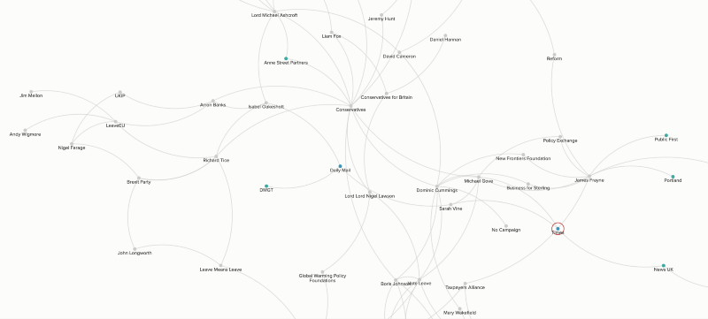
So far, I’ve spent a day entering some of the basic data into a spreadsheet, and have set up a very simple network map.
I’m going to focus on getting more of the data in for now, but once I have a fair amount I’ll then look at how to make the map more meaningful. That will be about deciding what makes entities or connection significant, and how to show that. For now, they are all shown just the same.
The early decisions have been on what data to gather now for each entity and connection. At first I’m going to capture the simplest possible — just a name, a ‘type’, a line or two of notes, some simple tags, and a hyperlink to a source. Later I can expand the data captured on particularly significant entities or connections.
Next I needed to decide what to capture as the ‘type’. This is key because it will be significant for ‘telling the story’ of the data later on which, with my journalist background, is all important.
There are (very good) arguments for making it as a simple as possible with fewer terms:
…but I decided to start with a few more options, on the grounds that it’d be easier to simplify (eg doing a search and replace in the sheet on one type to merge it with another type), than to add other options, which would need to be manual.
So for now, the types are…
Elements/Entities: Person, Company, Media, Campaign, Public Body
Connections: Control, Worked, Commercial (eg a client of a PR company), Funding, Supported (eg spoke on behalf of, put name to), Relationship (family, romantic), Located, Animosity (because sometimes it’s informative to see where hate or revenge is a motive).
As you can see, there is plenty of room to improve the wording. The main aim for now is just to gather the data, then learn from it — and with that greater understanding revisit the descriptors and tags.
Here’s a live version of the map, that you can see grow and develop as I work on it. You can soom and scroll as with a Google Map to explore it, and click on nodes and connections to get some more information:
If you want to follow along with this project, follow me on Twitter at @steveparks, as I’ll keep posting updates there. I’ll also blog about it from time to time here.
If you have any useful information, my Twitter DMs are open.